Before starting a letter, you should know the fundamental features of a letter. Let’s see them. Remember, an email is a letter, too.
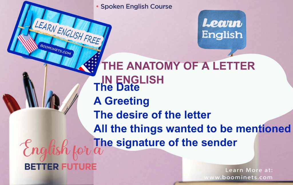
- The Date: It is the most significant feature of the letter. Its correct location of the date in the top right corner. If your letter is an email, it is not the thing you would be worried about.
- A Greeting: All the letters should have a greeting per the level of intimacy like “Hello, Mr. Blah Blah”, “Dear resident,”. Even the diaries have these: “Dear Diary,”
- The desire of the letter: This section should be clear and written like a sum up. All the things you want from the target person should be written in a close paragraph.
- All the things wanted to be mentioned: In this section of the letter, you can write down all the things you want to include in the letter.
- The signature of the sender: This section of the letter is you are leaving the letter to the target and sign the letter. Before the signature, the word “sincerely” is used to a friend. If the target of the letter is slight acquaintances, “yours truly” is used. If the targets are unknown people or the letter is for business purposes “yours faithfully” is used before the signature.
The Art of Letter Writing: Navigating the Depths of Effective Communication

Introduction
In an era dominated by emails and instant messaging, the traditional art of letter writing in English remains profoundly relevant. From formal business correspondence to heartfelt expressions, letters continue to serve as a powerful medium of communication. This article delves into the nuances of composing a compelling letter, examining its anatomy, various types, and the importance of proper structure.
The Anatomy of a Letter in English
Address and Date
Letters typically commence with the sender’s address followed by the date, situated in the top-right corner of the page. This serves to establish context and timeline for the correspondence.
Greeting and Salutation
The greeting, such as “Dear,” is followed by the recipient’s name and a comma. This sets the tone for the letter and establishes rapport with the reader.
Body of the Letter
The body comprises the main message, divided into paragraphs for clarity. It should be concise, informative, and engaging, effectively addressing the purpose of the letter.
Parts of a Letter
Heading
Includes the sender’s address and date, providing essential identification and reference details.
Inside Address
Contains the recipient’s address, ensuring the letter reaches the intended recipient.
Salutation
Formal greeting addressed to the recipient, such as “Dear Mr. Smith,” or “To Whom It May Concern.”
Body Text
Conveys the message, organized into paragraphs for coherence and readability.
Complimentary Close
The closing, such as “Sincerely” or “Yours faithfully,” signals the end of the letter and reflects the sender’s tone and relationship with the recipient.
Signature
Handwritten or digital, adds a personal touch and validates the authenticity of the letter.
Types of Letters
Formal Letters
Adhere to established conventions, commonly used for professional communication such as job applications or official inquiries.
Informal Letters
More casual and personal in tone, often exchanged between friends, family members, or acquaintances.
Business Letters
Tailored for corporate communication, including proposals, inquiries, or official correspondence with clients and stakeholders.
Personal Letters
Encompass a wide range of topics, from expressing gratitude to sharing news or offering condolences.
Importance of Proper Structure
Clarity and Organization
A well-structured letter enhances clarity and ensures the message is conveyed effectively, facilitating comprehension and response.
Professionalism and Courtesy
Proper structure demonstrates professionalism and respect for the recipient, contributing to a positive impression and fostering goodwill.
Tips for Writing Effective Letters

Understand the Audience
Tailor the tone, language, and content of the letter according to the recipient’s preferences, background, and relationship with the sender.
Clear and Concise Language
Use precise and straightforward language to convey the message, avoiding ambiguity or unnecessary details that may confuse the reader.
Proper Formatting
Adhere to standard formatting guidelines for letters, including appropriate margins, font size, and spacing, to enhance readability and aesthetics.
Common Mistakes to Avoid
Spelling and Grammar Errors
Proofread the letter meticulously to eliminate spelling and grammar mistakes, ensuring professionalism and credibility.
Ambiguity and Confusion
Avoid vague or ambiguous language that may lead to misunderstandings or misinterpretations of the message.
Frequently Asked Questions (FAQs)
What is the purpose of the inside address?
The inside address helps in directing the letter to the intended recipient by providing their contact details.
How do I format the date?
The date should be written in full, following the format: Month Day, Year (e.g., January 1, 2024).
What is a salutation?
A salutation is the formal greeting used to address the recipient, such as “Dear Mr. Smith,” or “To Whom It May Concern.”
Can I use contractions in formal letters?
It’s advisable to avoid contractions in formal letters to maintain a professional tone and convey seriousness.
How do I end a formal letter?
Formal letters are typically concluded with a complimentary close, such as “Sincerely” or “Yours faithfully,” followed by the sender’s signature.
Should I sign my name?
Yes, signing your name adds a personal touch and authenticity to the letter, reinforcing the sender’s identity.
Conclusion
Mastering the art of letter writing in English is crucial for effective communication across various contexts. By understanding its components, types, and best practices, individuals can elevate their letter writing skills and leave a lasting impression on recipients. Whether for business or personal correspondence, a well-crafted letter speaks volumes about the sender’s professionalism, courtesy, and attention to detail.
The Art of Typography: An In-Depth Guide

Table of Contents
- Introduction
- What is Typography?
- The Anatomy of Typography
- Understanding Typeface Classifications
- The Importance of Typography
- Essential Elements of Typography
- Basics: Difference between Font and Typeface, and Main Ways to Style Text
- Rules for Choosing the Right Typography for Project
- The Psychology of Fonts
- Timeline of 10 Famous Fonts
- Free Fonts to Try
- Conclusion
1. Introduction
Typography is an essential element of design that surrounds us in our everyday lives. Whether we realize it or not, it plays a significant role in delivering messages, evoking emotions, and creating a visual atmosphere. From the text on our smartphones to the signs on the streets, typography is a powerful tool that can make or break the effectiveness of a design. In this comprehensive guide, we will explore the art of typography, from its definition and anatomy to its importance and practical applications. So, let’s dive in and unlock the secrets of typography!
2. What is Typography?
Typography, as defined by Wikipedia, is the art and technique of arranging type. It encompasses the style, arrangement, and appearance of letters and digits. Its primary purpose is to make written language legible, readable, and visually appealing. Typography goes beyond simply choosing a font; it involves the selection and arrangement of typefaces, font styles, and structures to convey specific messages and evoke desired emotions.
Initially associated with print media, typography has expanded to the digital realm thanks to advancements in technology and the availability of vast libraries of free and premium typefaces. Designers constantly come up with new ideas and options to push the boundaries of typography. Today, typography is a crucial element in web design, branding, advertising, and various other forms of visual communication.
3. The Anatomy of Typography

To understand typography fully, it is essential to grasp the anatomy of letterforms. Each letter of the alphabet has its unique shape or structure, and understanding these components is crucial for designers and anyone working with text. Let’s explore the key elements of typography anatomy:
Baseline
The baseline is an imaginary horizontal line on which all characters sit. It provides a consistent foundation for the letters and ensures a balanced alignment.
Cap Height
The cap height is the height of uppercase letters from the baseline to the top of the letter. It represents the maximum height of the typeface and is measured from the baseline to the top of capital letters.
X-Height
The x-height refers to the height of lowercase letters, excluding ascenders and descenders, from the baseline to the top of the letters. It is an essential measurement in typography as it influences the overall legibility and readability of the text.
Ascender
The ascender is the part of a lowercase letter that extends above the x-height. It adds height and variation to the letterforms, giving them a unique visual appeal.
Descender
The descender is the part of a lowercase letter that extends below the baseline. It adds balance to the overall typography and can create interesting visual effects when combined with ascenders.
Serif
Serifs are small decorative strokes or tails at the ends of character strokes. They give a distinct look to typefaces and can convey different moods and styles. Serif typefaces are often associated with tradition, elegance, and formality.
Stem
The stem is the main vertical or diagonal stroke in a letterform. It provides structure and defines the overall shape of the character.
Counter
The counter refers to the enclosed or partially enclosed negative space within a letter. It can vary in size and shape, depending on the letter and typeface.
Bowl
The bowl is the rounded curve that covers the negative space in a letterform. It can be found in letters like “o,” “b,” and “d,” adding softness and visual interest to the typography.
Crossbar
The crossbar is a horizontal stroke that connects two stems or other parts of a letter. It can be seen in letters like “A” and “H” and adds stability and structure to the characters.
Terminal
The terminal is the endpoint or finishing point of a stroke or stem that has no serif. It can be sharp, rounded, or tapered, depending on the design of the typeface.
These are just a few of the essential elements of typography anatomy. Each letter has its unique combination of these elements, resulting in a diverse range of typefaces and styles. Understanding these components allows designers to manipulate and combine letterforms to create visually appealing and legible text.
4. Understanding Typeface Classifications

Typefaces can be classified into different categories based on their characteristics and styles. Understanding these classifications can help designers choose the right typeface for their projects. Let’s explore some of the common typeface classifications:
Serif
Serif typefaces are characterized by small decorative strokes, called serifs, at the ends of character strokes. They are often associated with tradition, elegance, and formality. Serif typefaces can be further categorized into sub-styles such as Old Style, Transitional, Neoclassical, and Slab.
Sans-Serif
Sans-serif typefaces, as the name suggests, do not have serifs. They have clean and simple lines, making them more modern and minimalistic in appearance. Sans-serif typefaces can be further classified into sub-styles such as Grotesque, Square, and Geometric.
Script
Script typefaces resemble handwriting and often have connecting strokes between letters. They add a sense of elegance, flow, and personal touch to the typography. Script typefaces can be further categorized into sub-styles such as Formal, Casual, and Calligraphic.
Display
Display typefaces are designed for larger sizes and are often used for headlines, titles, and other prominent elements. They are known for their unique and eye-catching designs, making them suitable for creating visual impact and attracting attention. Display typefaces can be further categorized into sub-styles such as Grunge, Psychedelic, Vintage, and Graffiti.
These are just a few examples of typeface classifications. Each category has its distinct style and purpose, allowing designers to choose typefaces that best suit their projects’ requirements and desired aesthetics.
5. The Importance of Typography
Typography plays a crucial role in design and communication. It is not just about choosing a beautiful font; it has a significant impact on how users perceive and interact with a design. Here are some reasons why typography is important:
Establishing Visual Hierarchy
Typography helps establish a visual hierarchy within a design. By using different typefaces, sizes, and styles, designers can guide the reader’s eye and emphasize important elements. This hierarchy ensures that the most critical information stands out and is easily accessible, improving the overall user experience.
Conveying Tone and Atmosphere
Typography sets the tone and atmosphere of a design. Different typefaces evoke different emotions and moods. For example, a playful and rounded typeface may convey a lighthearted and fun tone, while a bold and angular typeface can create a sense of strength and power. Choosing the right typography helps align the design with the intended message and target audience.
Enhancing Readability and Accessibility
Typography plays a vital role in readability and accessibility. Selecting typefaces and sizes that are easy to read ensures that the content can be consumed effortlessly. This consideration is crucial, especially in digital media, where users may have different screen sizes and reading conditions. Good typography improves accessibility for all users, including those with visual impairments.
Building Brand Recognition
Typography is an essential part of brand identity. Consistent use of specific typefaces helps establish brand recognition and differentiate a company from its competitors. When users see consistent typography across various touchpoints, they can quickly associate it with a particular brand, creating a sense of familiarity and trust.
Communicating with the Audience
Typography is a powerful communication tool. The choice of typefaces, styles, and layouts can convey messages and evoke emotions. It helps designers effectively communicate with their target audience and elicit specific responses or actions. Typography can make a design more engaging, persuasive, and memorable.
Enhancing User Experience
Good typography improves the overall user experience. Readable and well-designed typography makes it easier for users to navigate and understand the content. It reduces cognitive load and ensures that users can consume information quickly and effortlessly. By providing a pleasant reading experience, typography enhances user satisfaction and engagement.
Reinforcing the Message
Typography reinforces the message of the text. The right choice of typefaces and styles can emphasize key points, highlight important information, and evoke specific emotions. It helps guide the reader’s attention and reinforce the intended message, ensuring that it is effectively conveyed and remembered.
Influencing Decision Making
Typography can influence decision making. Studies have shown that the font’s selection can impact the reader’s reaction to and perception of the content. For example, certain typefaces, such as Arial, Verdana, and Comic Sans, have been found to be more appealing to readers on a subconscious level. By choosing the right typography, designers can optimize their content for better engagement and conversion rates.
Typography is a powerful design element that goes beyond mere aesthetics. It has a significant impact on how users perceive and interact with a design. By understanding the importance of typography and employing it effectively, designers can create visually appealing, engaging, and impactful designs.
6. Essential Elements of Typography
Typography encompasses various elements that contribute to the overall effectiveness and aesthetic appeal of a design. Let’s explore some essential elements of typography:
Hierarchy
Hierarchy refers to the organization and arrangement of text elements to create a visual order. By using different typefaces, sizes, and styles, designers can establish a hierarchy that guides the reader’s eye and emphasizes important information. Hierarchy ensures that content is structured, scannable, and easily digestible.
Contrast
Contrast is the difference between different typographic elements. It can be achieved through variations in typeface, size, weight, color, or spacing. Contrast helps create visual interest, highlight important elements, and improve readability. By using contrasting typefaces, weights, or colors, designers can create emphasis and draw attention to specific parts of the text.
Consistency
Consistency is key in typography. It ensures that the typography remains cohesive and harmonious throughout a design. Consistent use of typefaces, sizes, styles, and spacing creates a sense of unity and professionalism. It also helps users navigate and understand the content more easily, as they become familiar with the typography used in the design.
Alignment
Alignment refers to the positioning of text elements in relation to each other and the overall design. Proper alignment creates a clean and organized layout. It helps establish visual balance and guides the reader’s eye. Alignment can be used to create different effects, such as left-aligned, right-aligned, centered, or justified text. Each alignment choice has its purpose and impact on the overall design.
Color
Color plays a significant role in typography. It can be used to evoke emotions, create contrast, and enhance readability. Color can be applied to the text itself or used in the background or surrounding elements to create visual impact. When choosing colors for typography, it is important to consider legibility and ensure that the text stands out from the background.
White Space
White space, also known as negative space, refers to the empty space between text elements, lines, and paragraphs. It provides breathing room for the text and improves overall readability. White space helps create a sense of balance, clarity, and focus. It allows the text to stand out and reduces visual clutter. Proper use of white space enhances the overall aesthetic appeal and user experience.
By carefully considering and applying these essential elements, designers can create visually appealing and effective typography designs. Each element contributes to the overall readability, legibility, and impact of the text.
7. Basics: Difference between Font and Typeface, and Main Ways to Style Text
To understand typography fully, it is important to distinguish between two commonly used terms: font and typeface. While these terms are often used interchangeably, they have distinct meanings:
Font
A font refers to a specific size, weight, and style of a typeface. It represents a specific variation of a typeface, such as Arial Bold or Times New Roman Italic. Fonts can have different styles within the same typeface, allowing for variations in thickness, slant, or other design elements.
Typeface
A typeface, on the other hand, refers to a set of characters with a consistent design or style. It represents a family of related fonts that share similar design characteristics. For example, Arial is a typeface that includes different fonts within the family, such as Arial Regular, Arial Bold, and Arial Italic.
When styling text, there are two main ways to apply different variations:
Italic
Italic styling is a slanted version of a typeface that adds emphasis or emphasis to specific words or phrases within a text. It is often used for titles, subtitles, or other elements that need to stand out. Italic styling is commonly used for words in different languages or for reference links.
Bold
Bold styling is a way to add visual weight and emphasis to specific words or phrases within a text. It makes the text appear heavier and more prominent. Bold styling is often used for headings, subheadings, or important keywords within a body of text.
By understanding the difference between font and typeface and knowing how to style text effectively, designers can create visually appealing and well-structured typography designs.
8. Rules for Choosing the Right Typography for Project
When choosing typography for a project, there are some general rules and considerations to keep in mind. These guidelines can help designers make informed decisions and create typography designs that align with the project’s goals and target audience:
Understand Typeface Classifications
Before selecting a typeface, it is important to understand different typeface classifications and their characteristics. Serif, sans-serif, script, and display are some of the common classifications. Each classification has its own style and purpose, so choosing the right one for the project is crucial.
Consider the Project’s Personality
Typography should reflect the project’s personality and brand identity. Each typeface has its own character and vibe, so it is important to choose one that aligns with the project’s tone and atmosphere. Consider the desired traits, emotions, and messaging that the typography should convey.
Evaluate the Tone of the Message
Typography can influence how the message is perceived. Consider the tone of the message and choose a typeface that complements it. For serious or formal messages, opt for traditional or neutral typefaces. For playful or lighthearted messages, consider more whimsical or decorative typefaces.
Know Your Audience
Understanding the target audience is essential when choosing typography. Different age groups, cultures, and demographics may respond differently to certain typefaces. Consider the preferences and expectations of the target audience to ensure the typography resonates with them.
Serve the Primary Purpose
Typography should serve its primary purpose: to make the text legible, readable, and accessible. While creative and unique typefaces can be appealing, it is essential to prioritize readability and ensure that the characters are distinct and easy to read. Consider the intended medium and audience when selecting typefaces.
Be Web Browser Friendly
When designing for the web, it is important to choose typefaces that are web browser friendly. Some typefaces may not be supported by all browsers, leading to compatibility issues and poor user experience. Choose web-safe typefaces or consider using web font services to ensure maximum compatibility.
Limit the Number of Fonts
Using too many fonts can create visual clutter and confusion. Limit the number of fonts used in a design to maintain visual consistency and coherence. Stick to two or three fonts that complement each other and fulfill different purposes, such as body text, headings, and subheadings.
Test and Iterate
Typography choices should be tested and iterated upon to ensure their effectiveness. Conduct A/B tests and gather feedback to evaluate the impact of the chosen typography on the project’s goals. Analyze performance metrics and make adjustments as necessary to optimize the typography design.
By following these rules and considering the specific needs of the project, designers can choose typography that enhances the overall design, communicates effectively, and resonates with the target audience.
9. The Psychology of Fonts
Fonts have a psychological impact on how we perceive and interpret information. Different fonts can evoke different emotions and influence our responses to the content. Here are some key findings from the field of font psychology:
Serif vs. Sans-Serif
The debate between serif and sans-serif fonts has long been a topic of discussion. Research suggests that serif fonts, with their decorative strokes, are associated with tradition, formality, and reliability. Sans-serif fonts, on the other hand, are perceived as modern, clean, and approachable. The choice between serif and sans-serif fonts depends on the desired tone and personality of the design.
Readability and Legibility
Readability and legibility are crucial factors in font selection. Readability refers to how easy it is to read a body of text, while legibility refers to how easily individual characters can be distinguished. Fonts with clear, distinct characters and appropriate spacing are more readable and legible. Fonts with excessive ornamentation or complex designs can hinder readability and legibility.
Emotional Impact
Fonts can evoke specific emotions and moods. For example, script fonts are often associated with elegance, femininity, and romance. Bold, heavy fonts can convey strength, power, and authority. Choosing fonts that align with the desired emotional impact of the design can enhance the overall message and user experience.
Cultural Associations
Different cultures may have different associations with specific fonts. For example, certain fonts may be associated with specific industries or regions. Consider cultural associations when choosing fonts to ensure that the design resonates with the target audience and avoids potential misunderstandings or misinterpretations.
Brand Perception
Fonts play a significant role in brand perception. Consistent use of specific fonts can help establish brand recognition and reinforce brand values. Fonts should align with the brand’s personality and target audience to create a cohesive and memorable brand identity.
Understanding the psychology of fonts can inform font selection and enhance the effectiveness of typography designs. By considering the emotional impact, cultural associations, and brand perception, designers can create typography that resonates with the audience and effectively communicates the intended message.
10. Timeline of 10 Famous Fonts
Fonts have evolved over time, with new styles and designs constantly emerging. Let’s take a journey through the history of typography and explore the timeline of 10 famous fonts:
- Blackletter: Originating in the 12th century, Blackletter or Gothic fonts were commonly used for handwritten manuscripts and early printed books.
- Times New Roman: Developed in 1931, Times New Roman became one of the most widely used typefaces for printed materials, especially newspapers.
- Helvetica: Created in 1957, Helvetica is a sans-serif typeface known for its clean and modern design. It has become a staple in graphic design and is widely used today.
- Arial: Designed in 1982 as a Helvetica alternative, Arial is a sans-serif typeface commonly used in digital media and Microsoft products.
- Comic Sans: Created in 1994, Comic Sans is a casual, informal typeface often associated with a childlike or playful aesthetic. It has become both loved and loathed by designers.
- Impact: Designed in 1965, Impact is a bold, heavy typeface that is often used for headlines and titles. It creates a strong visual impact and is commonly associated with memes and internet culture.
- Futura: Developed in the 1920s, Futura is a geometric sans-serif typeface known for its clean lines and modern aesthetic. It has been used in many famous logos and designs.
- Gill Sans: Created in the 1920s by Eric Gill, Gill Sans is a humanist sans-serif typeface that combines classic and modern design elements. It is widely used in print and digital media.
- Baskerville: Designed in the 1750s, Baskerville is a transitional serif typeface known for its elegant and refined design. It is often used in high-quality printed materials and formal documents.
- Univers: Developed in the 1950s, Univers is a versatile and highly legible sans-serif typeface. It has a wide range of weights and variations, making it suitable for various design applications.
These 10 fonts represent different eras and styles in the history of typography. Each has made a significant impact on design and has its own unique characteristics and associations.
11. Free Fonts to Try
When it comes to typography, the options are endless. Here are five free fonts that you can try for your next design project:
- Montserrat: Montserrat is a versatile and elegant sans-serif font that works well in both print and digital media. It is highly legible and suitable for various design applications.
- Open Sans: Open Sans is a clean and modern sans-serif font that offers excellent readability. It has a wide range of weights and styles, making it a versatile choice for different design needs.
- Lato: Lato is a friendly and approachable sans-serif font with a humanist touch. It is easy to read and works well in both headlines and body text.
- Roboto: Roboto is a geometric sans-serif font with a modern and futuristic aesthetic. It is widely used in digital interfaces and offers excellent legibility on screens.
- Playfair Display: Playfair Display is an elegant and classic serif font that is perfect for creating a sophisticated and timeless look. It works well in both print and digital media.
These free fonts provide a good starting point for your typography designs. They offer a range of styles and aesthetics to suit different projects and design needs.
12. Conclusion
Typography is a powerful tool that influences how we perceive and interact with information. From its definition and anatomy to its classification and practical applications, typography plays a crucial role in design and communication. By understanding the fundamental principles of typography and considering its impact on readability, legibility, and user experience, designers can create visually appealing and effective typography designs. So, embrace the art of typography and let it elevate your designs to new heights!


